ShopDreamUp AI ArtDreamUp
Deviation Actions


Description
Please let me know what you think and any ideas/comments/critiques you have for me to improve. I'm working on being a better artist, and just feeling sick from looking at my art doesn't always help make it better. ")
sakfjs;lkdfj
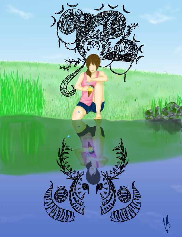
this stupid piece was so lsdkfjasdfil. But I learned a lot, so that's good. Still, it was my first real go at digital painting, everything else was kind of like "Derp, finish asap, need the animes, derp." but now that I'm taking art seriously, I spent almost all of yesterday trying to get it to look good, which I know isn't long for most artists, but still! My back hurt something fierce.
And the background.... eh, it's okay. But the person! I tried painting without a black outline, but idk, it looks so guuuhhh. Maybe I shaded it wrong? And then the face.... >.> I don't even want to get started on the face.
I think the ink thing looks okay....idk. It kind of goes with my original idea for this piece, which was inspired by the reflection of myself in murky pond water, making me think back to my first love that made me so happy, but the future of it (reflected in the water, kind of...) wasn't as happy. I think I kind of got that, although the bottom ink thing could be a bit meaner looking... maybe. Idk anything anymore.
siiiiggghhh. Anyways, good learning experience, taught me I still have a loooong way to go. Wish me luck! ^^
sakfjs;lkdfj
this stupid piece was so lsdkfjasdfil. But I learned a lot, so that's good. Still, it was my first real go at digital painting, everything else was kind of like "Derp, finish asap, need the animes, derp." but now that I'm taking art seriously, I spent almost all of yesterday trying to get it to look good, which I know isn't long for most artists, but still! My back hurt something fierce.
And the background.... eh, it's okay. But the person! I tried painting without a black outline, but idk, it looks so guuuhhh. Maybe I shaded it wrong? And then the face.... >.> I don't even want to get started on the face.
I think the ink thing looks okay....idk. It kind of goes with my original idea for this piece, which was inspired by the reflection of myself in murky pond water, making me think back to my first love that made me so happy, but the future of it (reflected in the water, kind of...) wasn't as happy. I think I kind of got that, although the bottom ink thing could be a bit meaner looking... maybe. Idk anything anymore.
siiiiggghhh. Anyways, good learning experience, taught me I still have a loooong way to go. Wish me luck! ^^
Image size
638x830px 534.66 KB
© 2014 - 2024 rainhorse
Comments9
Join the community to add your comment. Already a deviant? Log In
I like the subtleties going on in the pic, really shows you're thinking abstractly. The bottom ink design has a lot of points, and with the points facing the subject, it gives off the idea of pain or threat. I think you could push it a little more, but compared to the curved free-flowing pattern above, you can tell there is something a little less happy about the bottom. I also really like the subtle glow you did for the reflection to add more contrast in the otherwise washed out image. Really makes the bottom part pop.
Keep working on colors~
Keep working on colors~